![[Mockup] Product Detail-1.png](https://static.wixstatic.com/media/9902e1_ecd5ee836faa4984b5ba5749f2a878a4~mv2.png/v1/fill/w_270,h_500,al_c,q_85,usm_0.66_1.00_0.01,enc_avif,quality_auto/9902e1_ecd5ee836faa4984b5ba5749f2a878a4~mv2.png)
![[Mockup] Product Detail.png](https://static.wixstatic.com/media/9902e1_9aaecc0105af4f8a919e1102493f58f1~mv2.png/v1/fill/w_270,h_500,al_c,q_85,usm_0.66_1.00_0.01,enc_avif,quality_auto/9902e1_9aaecc0105af4f8a919e1102493f58f1~mv2.png)
![[Mockup] iPhone 17.png](https://static.wixstatic.com/media/9902e1_50f2c316d29748708ea4475c8b946abe~mv2.png/v1/fill/w_270,h_500,al_c,q_85,usm_0.66_1.00_0.01,enc_avif,quality_auto/9902e1_50f2c316d29748708ea4475c8b946abe~mv2.png)
IKEA Food
UI/UX design to iterate the IKEA Food Mobile to better support online ordering in the IKEA restaurants and bistros.
Team
1 Product owner, 2 PMs
2 designers, 5 engineers,
1 business analyst
Role
UX Design
Design System (icons)
User Research
Duration
6 months
Shipped in 2021
Scope
IKEA stores in China
😄
After
-
Overall customer dining experience is improved
-
The App is shipped to 30+ IKEA stores in China
-
The design solution is used by over 1 million IKEA customers
-
Drove an 89.7% increase in the food department's conversion rate
-
Successfully saved user order time by 5.7%
😞
Before
-
Tedious order flow
-
Crowded physical line
-
Disconnected with the IKEA member center
-
High complaint rates

Overview
IKEA is charting its course towards online shopping. As a pivotal initiative within IKEA's Digital Hub, the Food Mobile App aims to enhance customers’ shopping journeys. This endeavor isn't solely about the products - it seeks to streamline and digitize processes and interactions seamlessly, bridging the gap from backend operations to frontend experiences for a unified shopping experience.
Business Goal
-
Integrate the IKEA online membership center
-
Raise the overall revenue of IKEA restaurants
Product Goal
-
Increase the efficiency of the food ordering process
-
Improve the overall customer experience

Problem Define
How might we improve customers’ experience dining in IKEA stores?

Understand our user
IKEA Customers
/aɪˈkiːə ˈkʌstəmərz/ noun.
People who are shopping or have finished their shopping in IKEA stores.
When it comes to IKEA Food Department:
Our target users are narrowed down to those who want to dine in restaurants or bistros.
Research
Process Analysis
We wanted to figure out the traditional flow of ordering in the IKEA restaurant. According to my research, the ordering system consists of two main parts: M-line and Pick-up counter.


Research
On-site study
In order to better understand IKEA customers' behaviors, especially in dining areas, our team went to IKEA stores across five cities, collecting quantitative and qualitative data from both customers and staff.
Filed Observation
To have an overall knowledge of how long customers will spend on ordering and picking up food based on the current ordering system, we observed customers' behaviors to find out what made them confused during the process.
Interview
We wanted to find out how customers thought when they first used this ordering system to collect both positive and negative opinions from them. We interviewed young couples, moms with kids and older people to gather various feedback.

01
The traditional ordering system is complex and time-consuming.
02
It's hard to handle heavy dishes and find a seat at the same time.
03
The inflexible ordering system makes adding dishes even harder.

Context
-
Complex process
-
Overwhelming workload
-
Inflexible flow
Design opportunity
Online ordering
Problem Redefine
How might we shorten the time it takes people to order food?
Design
User flow
Instead of queuing in lines to choose food and check out, customers can order online everywhere in the store, and pick up food when they are notified. Ordering online provides customers with more flexibility.
.png)
Design
MVP release & roll-out
In order to test how Food Mobile can help customers with the ordering. We started our roll-out among bistros of IKEA stores in Shanghai, Zhejiang, and Jiangsu.
.png)

During the rolling out, we:
-
Observed and assisted customers ordering with Food Mobile
-
Did surveys among customers who have finished ordering with Food Mobile
-
Held info session for bistro staff and interviewed them afterward

Pain points
01
Some flows were tedious and may lead to select errors, which diminished the user experience.
02
The UI components on some pages were not clear enough to guide customers to collect food.
03
The visual style is not as consistent as the other digital products of IKEA.
Solutions
01
Redesign the part of complex user flow to make it simple and clear.
02
Create UI rules for the Mobile App to stipulate the grid system, colors, and icons.
03
Redesign the UI to keep the whole style cohesive and consistent with IKEA aesthetics.
Iterate
UI redesign
Icons play a crucial role in maintaining consistency across all pages. In the previous version, inconsistencies arose due to variations in sizes, stroke weights, and corner radians. Taking charge of the icon redesign, I engaged in multiple iterations to ensure uniformity. The newly redesigned icons have now been implemented across the current user interfaces of the Food mini program.
01
Consistent with IKEA Brand Style
Ensuring redesigned icons align with IKEA's established brand patterns.
02
Simplified and User-Centric
Creating intuitive icons for both in-store and mobile users, enhancing usability.
03
Trustworthy Aesthetic
Maintaining a style that reflects IKEA's trusted brand identity.
04
Contextual Considerations
Adapting designs for crowded store environments with simple, visible patterns.

Before

After
Iterate
A/B Testing
To establish the layout of the food items on the menu page, we scheduled A/B testing with the aim of identifying a menu sequence that aligns better with our business objectives and profitability.
.png)
.png)
Test Data
Based on the data, while there was a slight decline in the number of customers and orders within Group B, both the unit price and total sales showed a notable increase of over 2% each. Given the overall positive performance observed in Group B, we've chosen to maintain that approach in the menu.
.png)
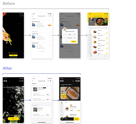
Iterate
User journey
With a streamlined mobile application, customers begin by scanning the QR code located throughout the IKEA store. With straightforward guidance provided, they can efficiently complete their online orders in less time. Once the food is ready, customers will receive a notification and can collect their order with their designated pick-up number at the counter.
🤯
Before
😊
After

Release
Launch the App
The app was effectively launched and adopted by nearly all IKEA stores in China. Continuous monitoring of the data post-launch revealed significant improvements. The average start-up time decreased from 2.5s to 2.1s, while the time customers spent on ordering decreased by over 5%, aligning with our goal of expediting the ordering process. Additionally, alongside our user-centric objectives, there was a notable increase in the overall conversion rate and business sales.

Release
Measuring success
100%
The App is applied in all IKEA store in China
2.1 s
The average starting time dropped from 2.5s to 2.1s.
5.7%
The average time it takes customers to order decreased by more than 5.7%.
19%
19% decreased on pages viewing.
89.7%
The conversion rate also went up slightly.
Reflection
01
Storytelling and cross-functionally collaboration matter
Cross-functional collaboration holds immense significance in shaping user experiences that resonate deeply with audiences. Storytelling in UX design involves crafting narratives that guide users through their journey with a product or service, fostering engagement and emotional connection.
02
Design decisions are always driven by users
User-centric design decisions serve as the guiding principle in every aspect of the design process. Understanding the needs, preferences, and behaviors of users is paramount to creating products and services that truly resonate with their intended audience. By conducting thorough user research, including interviews, surveys, and usability testing, UX designers gain valuable insights into the target users' motivations and pain points.
03
Setting metrics ahead and tracking alongside are necessary
Establishing clear metrics and diligently tracking them throughout the design process are essential practices. Setting metrics upfront provides a framework for defining success criteria and aligning design decisions with overarching project goals. These metrics may encompass various aspects of the user experience, such as usability, engagement, satisfaction, and conversion rates.
Other projects


